
Page 89 - Lighting the Un-lightable 2015
P. 89
The volume of light in this space was extremely inconsistent:
Note the intensity of the light on her chest, arms and face. Akira has
highly reflective skin and I had to make sure that the light across
her body wrapped the contours of her face, arms and chest such that
1 the lighting looked "natural." Some areas of her skin are also darker,
almost as though she has tan lines, and I had to make sure that I ren-
dered her skin tones as uniform as possible. Her pearls, earrings and
the fan added a measure of complexity that really challenged - and
limited - potential lighting solutions.
This was the most difficult area to light. White lace. I needed to cap-
ture the detail of the lace, expose the skin of her leg to make it look
2 realistic. The white of the lace against the brown tones of her skin and
black hair were critical to the emotional experience as well. Note the
sheen on her hair. It had to match the sheen on her skirt, the fan. and
her body.
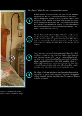
Here, I had many concerns. To be consistent with Hururell's style, I
would need to make sure that some of the shadows cast a sharp line
5 3 while others transitioned softly. I was very concerned that I would
lose detail in the bed, comforter, headboard, and walls. Breaking the
light above and slightly in front of her thigh raised the volume of
light enough in that space to capture the emotional and visual effect
I wanted. Note also that the detail in the pillow behind her comple-
ments the scene without intruding excessively into the scene.
4 The volume of light was at its lowest here. I wanted as little detail as
possible here so that the viewer's eye wasn't distracted. This area had
to blend seamlessly with the rest of the image. The pattern of diffusion
worked as anticipated.
2
The success or failure of this image came down to how well I handled this area. Too much light here would have pulled the viewer's
eye away from Akira. Too little would have made the image look like it had been artificially lit. The goal is always to make the image
look exactly the way the human eye sees it.
| 89